| Framed Art |
| Here are some examples of the framing choices made by my partner LouAnn Phillips for my art. |

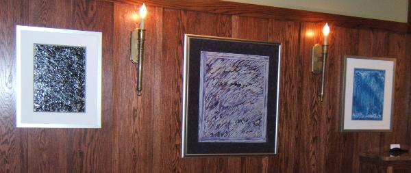
| The two paintings on the outside, White Comets, Black Sky (on the left) and Blue orroZ (on the right - an allusion to the blue, backwards Z) were framed identically, and made a nice pairing. The one in the middle, Texture Pane, was similarly framed. Because they went so well together, we hung them in my third show, in a row together - as shown below at the Canaan Gallery in the Inn at Ragged Gardens. |
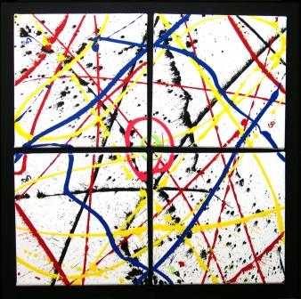
| The piece to the left is interesting in that it is actually four paintings, done at the same time. Each one is 12" x 12". I asked my framer Rob if he could make them detachable and he said Yes! So, each of the four is mounted with Velcro and may be removed and replaced As You Like It, which, became the name of the piece. I have a lot of fun watching people playing around with different patterns of placement. Kids especially get a kick out of this one! |
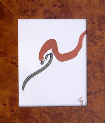
| The small painting at the right was originally titled Dinner, because it reminded me of a dinosaur eating its prey. Then, a friend, Michael-Dale, said it looked like "One of those old movie spy women, looking back." So, the name Mata Hari Glance was born. When we went to find a frame, this deco style jumped out at Lou and she was right. It's perfect! |
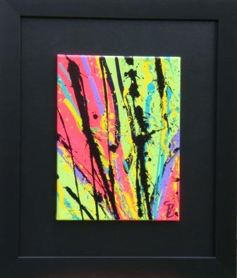
| These two bright pieces were painted during the same period and Lou chose perfectly matching presentations, in the black mattes and framing. The one on the left, Psychesplatic reminded me of the Sixties bright psychedelic look, and since I always say I'm a "splatter guy," ergo the title. The one on the left got its name by way of my son, Chris, who said it looked like Van Gogh's profile. Thus, the title Vincent's Missing Ear. |
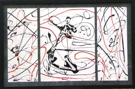
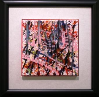
| This piece, The Matador, is huge - and heavy! Because it was painted on watercolor paper, it had to be put behind glass. Sold by the pound, this would be one of my priciest pieces! We have used this combination of dark grey matte, kind of a mottled leathery look, with a simple, black frame. It looks great on all the paper pieces, especially those that are in the same color range, the black-red-white pieces, in particular. |
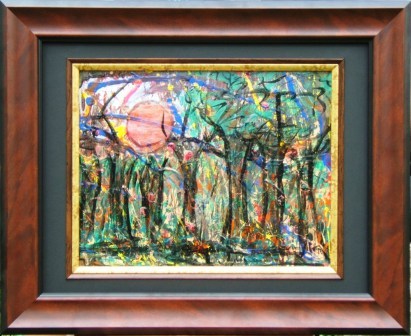
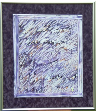
| This is a great example of Lou's great eye for something deceptively simple yet elegant. The frame is a nice, dark wood, with clean lines. She enhanced the framing design by adding a dark matte with a gold fillet which picked up on some of the tones in the painting, which is titled Rainforest Sunset. An interesting note here is that this piece has been over-painted at least twice, so the image is a third generation of whatever it started out to be, before I was satisfied with it! |
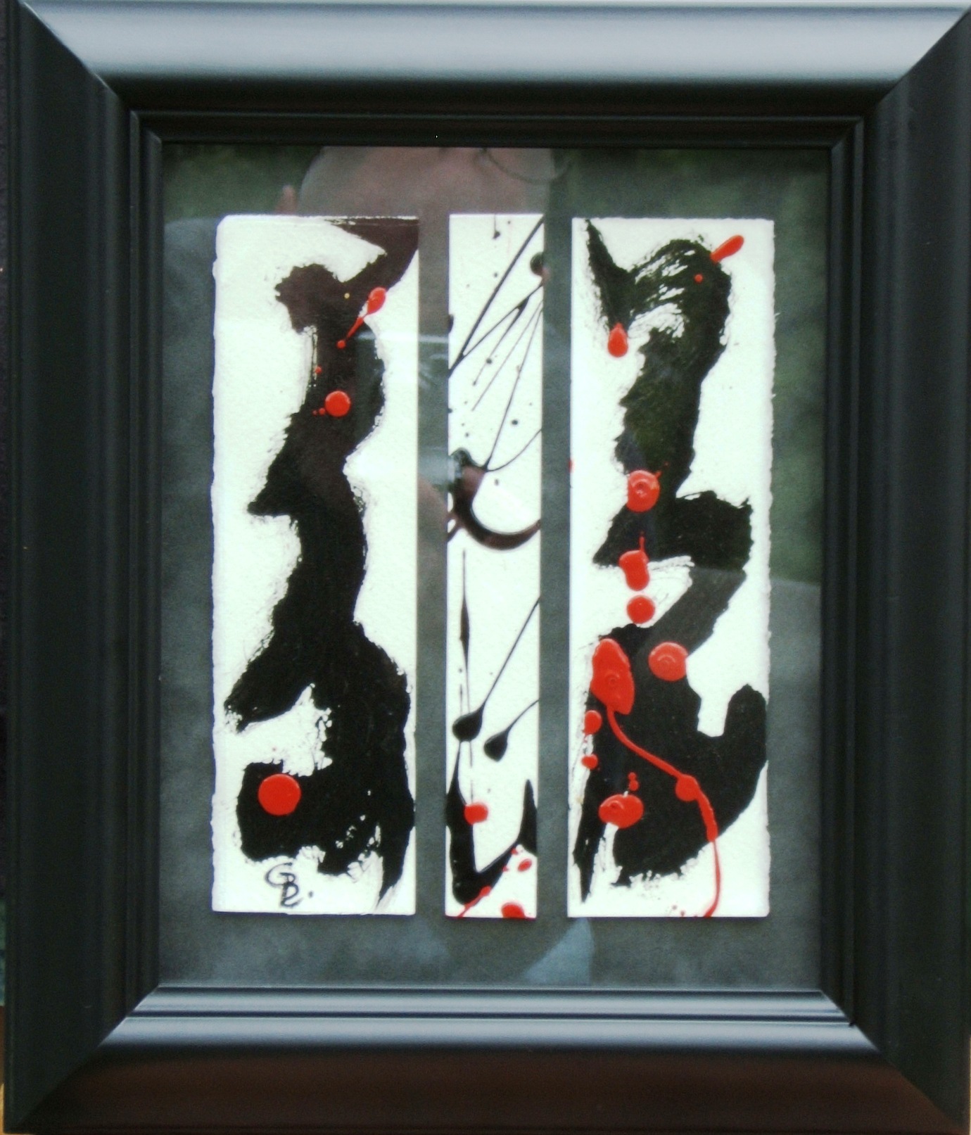
| This small but "elegant" piece (as described by one of my favorite artists, Zoey Brookshire - check out her site here), Zendo is a tryptich on paper, under glass - difficult to photograph. If you look closely, you can see my reflection as I took the picture! |
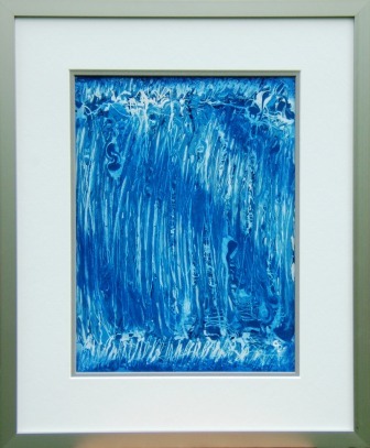
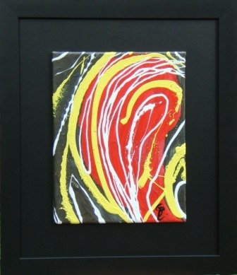
| You can see by the shadow under the painting itself that this piece is raised over the silvery matte, which also has a recessed red matte underneath to pick up on the highlights of Spirit Fire. |
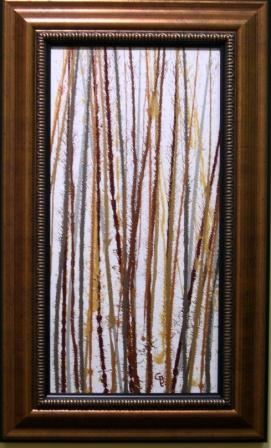
| Finally, this is a piece that Lou me to do especially for her. It's called Winter Birches, and was done by slinging metallic paints onto an elongated, vertical canvas. The paint had to be the correct viscosity to obtain the desired results, that being thick lines with very fine "spiking" on the sides. She later chose the perfect frame (as usual!) to capture the earthy quality of the piece, and then hung it in her formal formal room where, I have to admit, it looks terrific! |
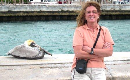
| Lou and a friend in Florida! |